
Build Modern Frontend App using Vue.js and Tailwind CSS
What is Vue
Vue (pronounced /vju:/, like view) is a JavaScript framework for building user interfaces. It builds on top of standard HTML, CSS, and JavaScript and provides a declarative, component-based programming model that helps you efficiently develop user interfaces of any complexity.
What is Tailwind CSS
Tailwind CSS is A utility-first CSS framework packed with classes like
flex, pt-4, text-center and rotate-90 that can be composed to build any design, directly in your markup.
What is TypeScript
TypeScript is a strongly typed programming language that builds on JavaScript, giving you better tooling at any scale. TypeScript is JavaScript with syntax for types.
Why Vue
you can visit this page and see the video
What You Need
- Basic understanding of HTML, CSS, JavaScript/Node.js
- Basic understanding of using TypeScript
- Install Visual Studio Code
- Install Vue extension
- Install Tailwind CSS extension
- or you can use your favorite IDE such as WebStorm or your favorite text editor
What we'll be building
For this blog post, we'll build a simple Sign-in page and Forgot Password page.
Also we'll be using Vue Composition API and TypeScript.
Installation
Install Node.js version 18.3 or higher you can install it through here.
I recommend using nvm (Node Version Manager)
# Download and install nvm:
curl -o- https://raw.githubusercontent.com/nvm-sh/nvm/v0.40.1/install.sh | bash

# Download and install Node.js:
nvm install 22

# Verify the Node.js version:
node -v # Should print "v22.13.1".
nvm current # Should print "v22.13.1".

# Verify npm version:
npm -v # Should print "10.9.2".
By using nvm, you will have the flexibility to choose which node version you need to use for each project or repository.
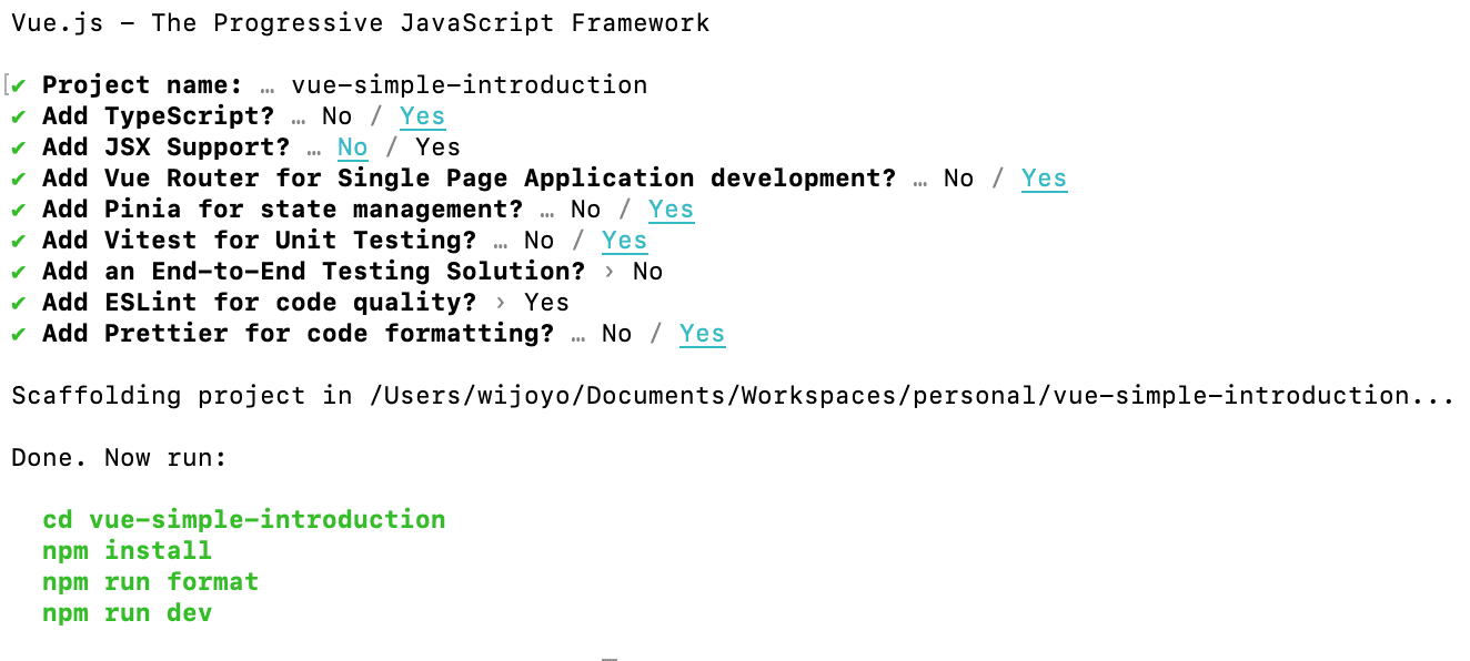
Create Your Vue Project in your directory and choose your project configuration
npm create vue@latest
it should look like this
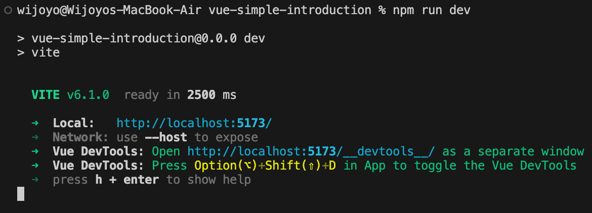
and then run these command
cd <your-project-name>
npm install
npm run format
npm run dev
after run the command above your console or terminal will look like this
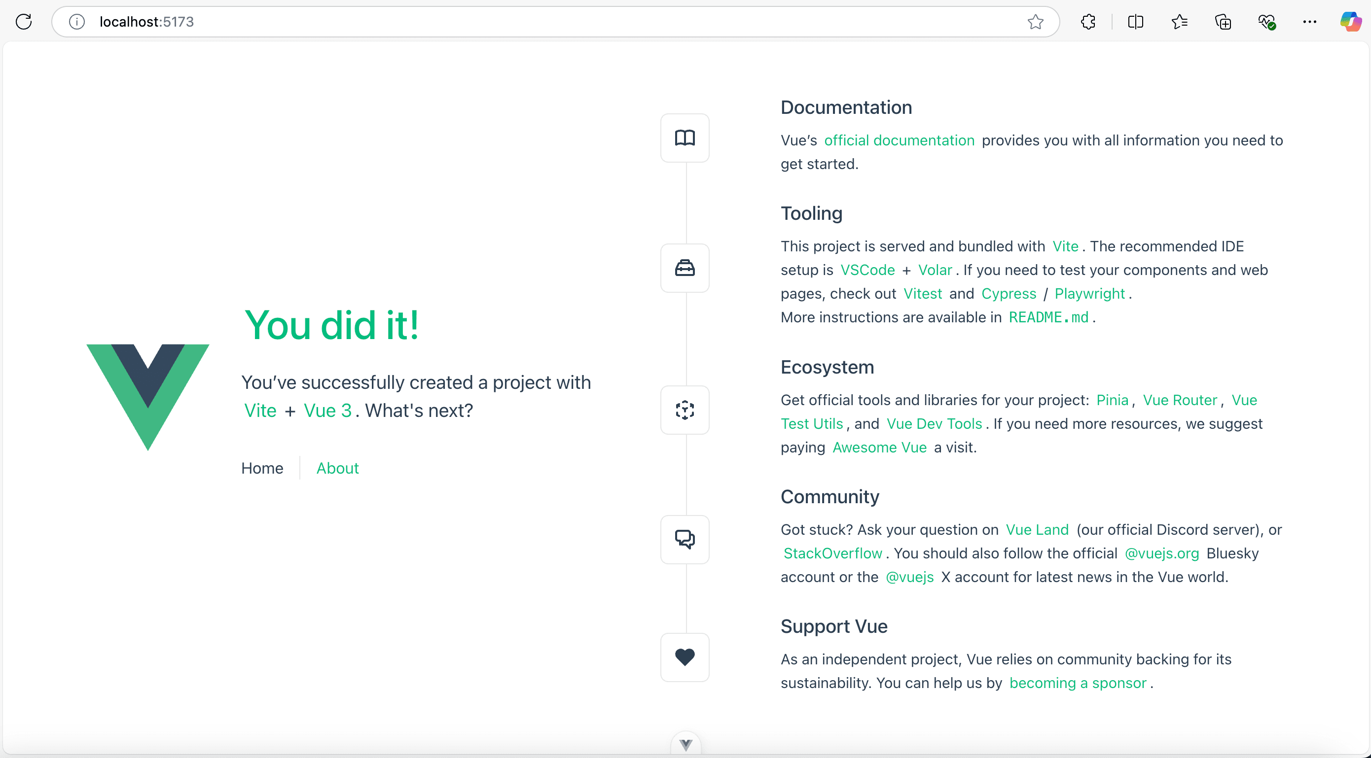
and then open your web browser. Go to http://localhost:5173/
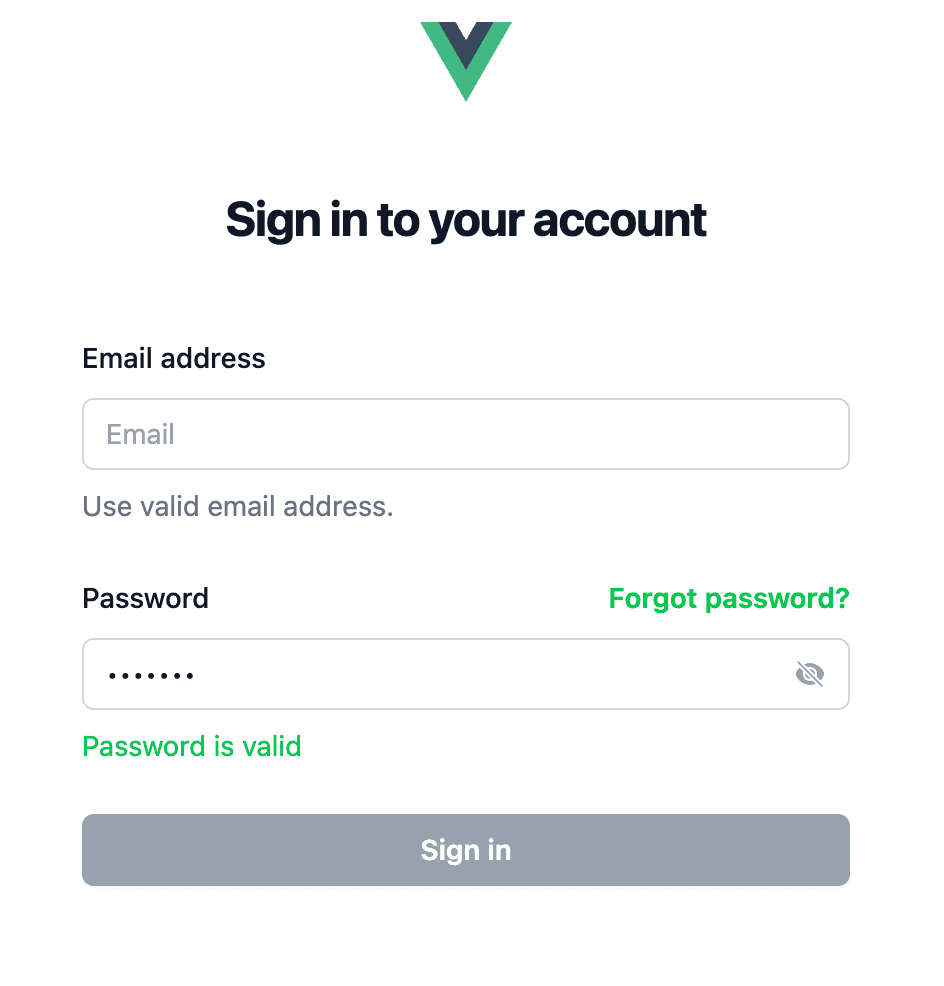
you should see this page
Install Tailwind CSS
run this command line
npm install tailwindcss @tailwindcss/vite
or visit here
and in your vite.config.ts
import { defineConfig } from 'vite'
import tailwindcss from '@tailwindcss/vite' // add this line
export default defineConfig({
  plugins: [
    tailwindcss(), // add this line
  ],
})
then inside file assets/main.css
Add an @import to your CSS file that imports Tailwind CSS.
@import "tailwindcss";
Install Hero icons
npm install @heroicons/vue
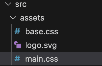
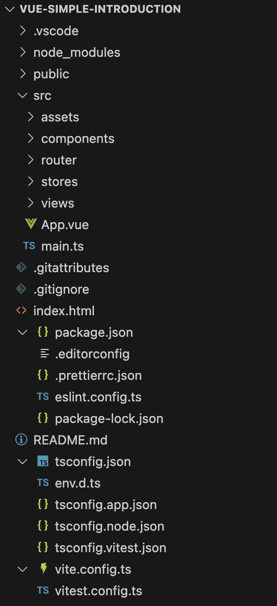
Project Structure
in your vscode, the project structure looks like image below
-
public: all the static content that will be directly copied at the root of the web server -
assets: for storing images (.jpg, .png, .svg) or files or stylesheet (.css) file or font file (.ttf) -
components: our project vue component -
router: our project http routes -
stores: data stores (pinia or vuex) -
views: our app pages like HomeView page and AboutView page -
App.vue: Your root Vue component, which contains the entire application -
main.ts: the entry point of the entire application's JavaScript/TypeScript code -
index.html: the entry point of the entire application's HTML code
Single-File Components (SFC)
Vue Single-File Components (a.k.a. *.vue files, abbreviated as SFC) is a special file format that allows us to encapsulate the template (HTML), logic (JavaScript), and styling (CSS) of a Vue component in a single file.
- the
<template>tag contains the HTML code of the component - the
<script>tag (optional) contains the JavaScript/TypeScript code of the component - the
<style>tag (optional) contains the CSS style of the component
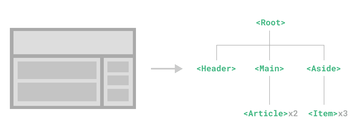
Components Basics
Components allow us to split the UI into independent and reusable pieces, and think about each piece in isolation. It's common for an app to be organized into a tree of nested components:
Create Sign in Page
Before we create our sign in page, We need to do a few things
First refactor App.vue
<script setup lang="ts">
import { RouterView } from 'vue-router'
</script>

<template>
  <RouterView />
</template>

<style scoped>
</style>
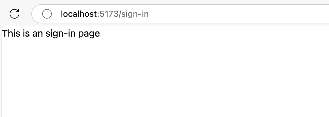
create views/SigninView.vue
<script setup lang="ts"></script>

<template>
  <div class="sign-in">
    <h1>This is an sign-in page</h1>
  </div>
</template>

<style scoped>
</style>
add new route inside router/index.ts
import { createRouter, createWebHistory } from 'vue-router'
import SigninView from '@/views/SigninView.vue' // add this line

const router = createRouter({
  history: createWebHistory(import.meta.env.BASE_URL),
  routes: [
    // update this route
    {
      path: '/',
      redirect: { name: 'sign-in' },
    },
    // add this route
    {
      path: '/sign-in',
      name: 'sign-in',
      component: SigninView,
    },
  ],
})
inside assets/main.css should be like this (delete other line of code)
@import 'tailwindcss';
you should see like image below
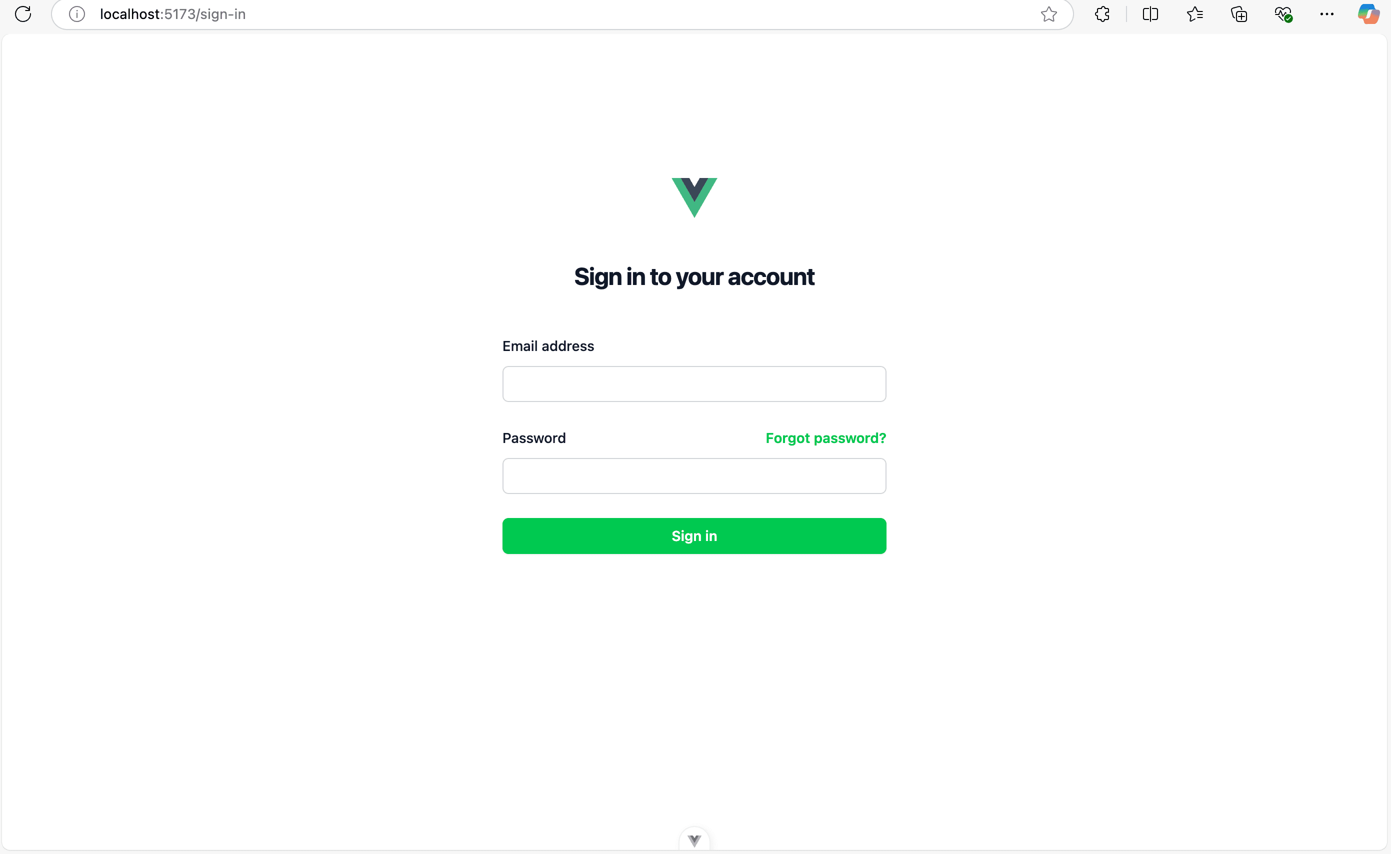
then update our views/SigninView.vue
<script setup lang="ts">
// import { RouterLink } from 'vue-router' // we will use this later
</script>

<template>
  <div class="flex min-h-full flex-1 flex-col justify-center px-6 py-36 lg:px-8">
    <div class="sm:mx-auto sm:w-full sm:max-w-sm">
      <img alt="Vue logo" class="mx-auto h-10 w-auto" src="@/assets/logo.svg" />
      <h2 class="mt-10 text-center text-2xl/9 font-bold tracking-tight text-gray-900">
        Sign in to your account
      </h2>
    </div>

    <div class="mt-10 sm:mx-auto sm:w-full sm:max-w-sm">
      <form class="space-y-6" action="#" method="POST">
        <!-- TODO replace input and label component -->
        <div>
          <label for="email" class="block text-sm/6 font-medium text-gray-900">Email address</label>
          <div class="mt-2">
            <input
              type="email"
              name="email"
              id="email"
              autocomplete="email"
              :required="true"
              class="block w-full rounded-md bg-white px-3 py-1.5 text-base text-gray-900 outline-1 -outline-offset-1 outline-gray-300 placeholder:text-gray-400 focus:outline-2 focus:-outline-offset-2 focus:outline-green-600 sm:text-sm/6"
            />
          </div>
        </div>

        <!-- TODO replace input and label component -->
        <div>
          <div class="flex items-center justify-between">
            <label for="password" class="block text-sm/6 font-medium text-gray-900">Password</label>
            <div class="text-sm">
              <a href="#" class="font-semibold text-green-500 hover:text-green-600"
                >Forgot password?</a
              >
            </div>
          </div>
          <div class="mt-2">
            <input
              type="password"
              name="password"
              id="password"
              autocomplete="current-password"
              :required="true"
              class="block w-full rounded-md bg-white px-3 py-1.5 text-base text-gray-900 outline-1 -outline-offset-1 outline-gray-300 placeholder:text-gray-400 focus:outline-2 focus:-outline-offset-2 focus:outline-green-600 sm:text-sm/6"
            />
          </div>
        </div>

        <!-- TODO replace component -->
        <div>
          <button
            type="submit"
            class="flex w-full justify-center rounded-md bg-green-500 px-3 py-1.5 text-sm/6 font-semibold text-white shadow-xs hover:bg-green-600 focus-visible:outline-2 focus-visible:outline-offset-2 focus-visible:outline-green-600"
          >
            Sign in
          </button>
        </div>
      </form>
    </div>
  </div>
</template>

<style scoped></style>
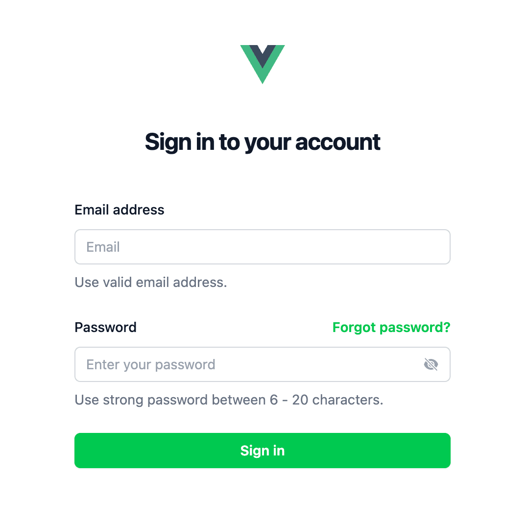
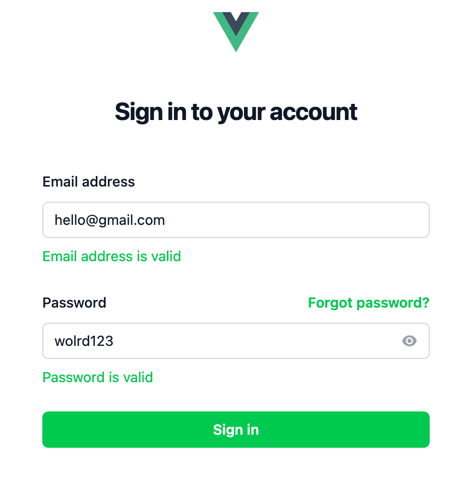
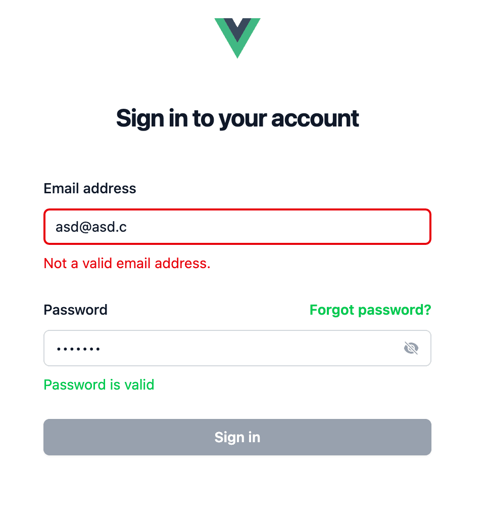
Go to http://localhost:5173/sign-in and see the sign-in page
Congratulations for creating the sign in page for our frontend app!
Create Forgot Password Page
Create our views/ForgotPasswordView.vue
<script setup lang="ts">
import { RouterLink } from 'vue-router'
import { ArrowLeftIcon } from '@heroicons/vue/24/solid'
</script>

<template>
  <div class="flex min-h-full flex-1 flex-col justify-center px-6 py-36 lg:px-8">
    <div class="sm:mx-auto sm:w-full sm:max-w-sm">
      <img alt="Vue logo" class="mx-auto h-10 w-auto" src="@/assets/logo.svg" />
      <div class="flex mt-10">
        <RouterLink :to="{ name: 'sign-in' }">
          <ArrowLeftIcon class="size-6 text-green-600 my-2" />
        </RouterLink>
        <h2 class="flex-1 text-center text-2xl/9 font-bold tracking-tight text-gray-900">
          Reset Password
        </h2>
      </div>
    </div>

    <div class="mt-10 sm:mx-auto sm:w-full sm:max-w-sm">
      <form class="space-y-6" action="#" method="POST">
        <!-- TODO replace input and label component -->
        <div>
          <label for="email" class="block text-sm/6 font-medium text-gray-900">Email address</label>
          <div class="mt-2">
            <input
              type="email"
              name="email"
              id="email"
              autocomplete="email"
              :required="true"
              class="block w-full rounded-md bg-white px-3 py-1.5 text-base text-gray-900 outline-1 -outline-offset-1 outline-gray-300 placeholder:text-gray-400 focus:outline-2 focus:-outline-offset-2 focus:outline-green-600 sm:text-sm/6"
            />
          </div>
        </div>

        <!-- TODO replace component -->
        <div>
          <button
            type="submit"
            class="flex w-full justify-center rounded-md bg-green-500 px-3 py-1.5 text-sm/6 font-semibold text-white shadow-xs hover:bg-green-600 focus-visible:outline-2 focus-visible:outline-offset-2 focus-visible:outline-green-600"
          >
            Submit
          </button>
        </div>
      </form>
    </div>
  </div>
</template>

<style scoped></style>
update router/index.ts
import { createRouter, createWebHistory } from 'vue-router'
import SigninView from '@/views/SigninView.vue'
import ForgotPasswordView from '@/views/ForgotPasswordView.vue'

const router = createRouter({
  history: createWebHistory(import.meta.env.BASE_URL),
  routes: [
    {
      path: '/sign-in',
      name: 'sign-in',
      component: SigninView,
    },
    // add this one
    {
      path: '/forgot-password',
      name: 'forgot-password',
      component: ForgotPasswordView,
    },
  ],
})
update our views/SigninView.vue
from
<template>
  ...
  <a href="#" class="font-semibold text-green-500 hover:text-green-600"
    >Forgot password?</a
  >
</template>
to
<script setup lang="ts">
import { RouterLink } from 'vue-router'
</script>

<template>
  ...
  <RouterLink
    :to="{ name: 'forgot-password' }"
    class="font-semibold text-green-500 hover:text-green-600"
  >
    Forgot password?
  </RouterLink>
</template>
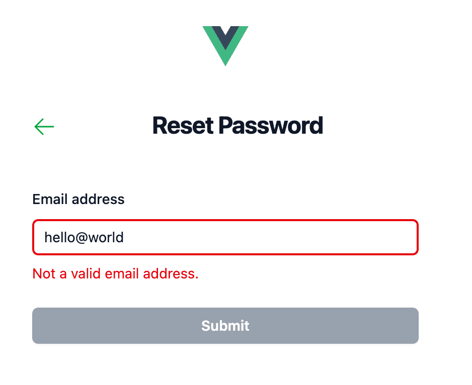
now you can go to http://localhost:5173/forgot-password by clicking Forgot password?
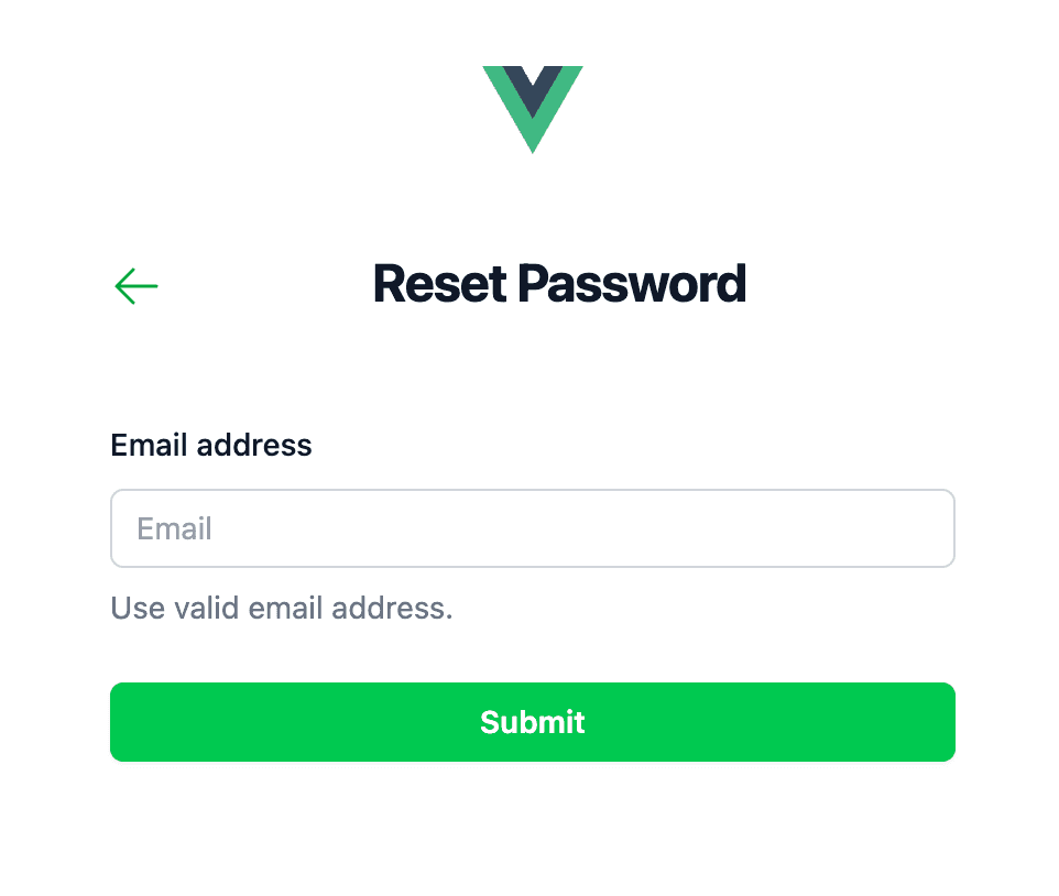
and you should see this
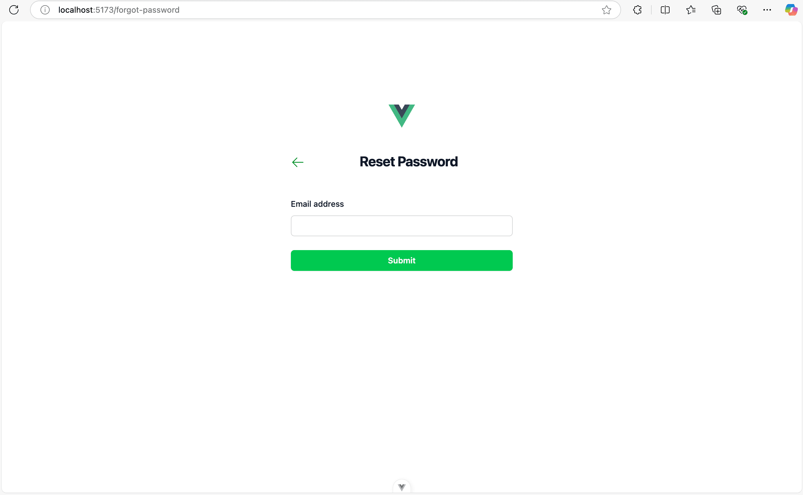
Congratulations for creating the forgot password page for our frontend app!
Component
As you can see there is a redundant code like the <input> email element. It is used two times.
And there is redundancy for <button> element. It is used two times. (I already comment it with TODO)
Before create our button component and input component.
Let's ask What is a component? and Why use a component?
What is a component
A component is a reusable, self-contained piece of UI that can be used across an application. Components help organize, modularize, and reuse UI elements efficiently.
A component is like an encapsulation in Object Oriented Programming (OOP).
In Vue, a component is typically a .vue file that contains:
- Template (HTML structure)
- Script (Logic and data)
- Style (CSS)
Why use a component
Components solve common problems in UI development by making code:
-
✅ Reusable (like buttons, modals, input text, input checkbox) Instead of writing the same code multiple times, you create a component once and reuse it.
-
✅ Maintainable If the UI is built from components, it's easier to maintain because each part is isolated.
-
✅ Encapsulated (Modular) Each component manages its own state and does not affect other components unless explicitly needed.
Example in Vue (Isolated Counter Component)
<!-- ounter.vue -->
<template>
  <div>
    <p>Count: {{ count }}</p>
    <button @click="count++">Increment</button>
  </div>
</template>

<script setup>
import { ref } from "vue";
const count = ref(0);
</script>
Each instance of <Counter /> will have its own state.
Button Component
So we'll build vue component to ensure reusability and independent. First we'll create the button component.
components/ButtonComponent.vue
<script lang="ts" setup>
type Booleanish = boolean | 'true' | 'false'

const props = defineProps<{
  disabled?: Booleanish
  form?: string
  formaction?: string
  formmethod?: string
  formtarget?: string
  type?: 'submit' | 'reset' | 'button'
  class?: string
}>()

defineSlots<{
  default(): void
}>()
</script>

<template>
  <div>
    <button
      v-bind="props"
      class="flex w-full justify-center rounded-md px-3 py-1.5 text-sm/6 font-semibold text-white shadow-xs"
      :class="[
        disabled
          ? 'bg-gray-400 hover:bg-gray-400/75 cursor-not-allowed'
          : 'bg-green-500 hover:bg-green-600 cursor-pointer focus-visible:outline-2 focus-visible:outline-offset-2 focus-visible:outline-green-600',
      ]"
    >
      <slot></slot>
    </button>
  </div>
</template>

<style scoped>
</style>
and then we can replace the button in SigninView.vue & ForgotPasswordView.vue
from
<div>
  <button
    type="submit"
    class="flex w-full justify-center rounded-md bg-green-500 px-3 py-1.5 text-sm/6 font-semibold text-white shadow-xs hover:bg-green-600 focus-visible:outline-2 focus-visible:outline-offset-2 focus-visible:outline-green-600"
  >
    Sign in
  </button>
</div>
to
<script setup lang="ts">
import ButtonComponent from '@/components/ButtonComponent.vue'
</script>

<template>
  ...
  <ButtonComponent type="submit">
    <template #default>Sign in</template>
  </ButtonComponent>
</template>
Input Component
Let's create the input component for email and password. components/InputFieldComponent.vue
<script lang="ts" setup>
type Booleanish = boolean | 'true' | 'false'

type InputType = string | 'email' | 'hidden' | 'number' | 'password' | 'text'

const model = defineModel()

const props = defineProps<{
  id?: string
  label: string
  name: string
  type: InputType

  placeholder?: string
  autocomplete?: string
  required?: Booleanish
  disabled?: Booleanish
  class?: string

  error?: Booleanish
}>()

const slots = defineSlots<{
  cornerHint?(): void
  iconAfter?(): void
  helpText?(): void
}>()
</script>

<template>
  <div>
    <div class="flex items-center justify-between">
      <label :for="name" class="block text-sm/6 font-medium text-gray-900">{{ props.label }}</label>

      <div v-if="slots.cornerHint" class="text-sm">
        <slot name="cornerHint"></slot>
      </div>
    </div>

    <div class="mt-2 grid grid-cols-1">
      <input
        v-model="model"
        v-bind="props"
        class="col-start-1 row-start-1 block w-full rounded-md bg-white px-3 py-1.5 text-base text-gray-900 outline-1 -outline-offset-1 outline-gray-300 placeholder:text-gray-400 focus:outline-2 focus:-outline-offset-2 sm:text-sm/6"
        :class="[error ? 'focus:outline-red-600' : 'focus:outline-green-600']"
      />
      <slot v-if="slots.iconAfter" name="iconAfter"></slot>
    </div>
    <slot v-if="slots.helpText" name="helpText"></slot>
  </div>
</template>

<style scoped></style>
and create a new composable helper/InputComposable.ts
export function usePasswordToggle() {
  const isShowPassword = ref<boolean>(false)
  const passwordInputType = ref<string>('password')

  function handlePasswordToggle() {
    isShowPassword.value = !isShowPassword.value

    if (passwordInputType.value === 'text') {
      passwordInputType.value = 'password'
    } else {
      passwordInputType.value = 'text'
    }
  }

  return { isShowPassword, passwordInputType, handlePasswordToggle }
}
Let's replace the input in SigninView.vue for email and password
from
<div>
  <label for="email" class="block text-sm/6 font-medium text-gray-900">Email address</label>
  <div class="mt-2">
    <input
      type="email"
      name="email"
      id="email"
      autocomplete="email"
      :required="true"
      class="block w-full rounded-md bg-white px-3 py-1.5 text-base text-gray-900 outline-1 -outline-offset-1 outline-gray-300 placeholder:text-gray-400 focus:outline-2 focus:-outline-offset-2 focus:outline-green-600 sm:text-sm/6"
    />
  </div>
</div>
to
<script setup lang="ts">
import { reactive } from 'vue'
import { RouterLink } from 'vue-router'
import ButtonComponent from '@/components/ButtonComponent.vue'
import InputFieldComponent from '@/components/InputFieldComponent.vue'
import { usePasswordToggle } from '@/helper/InputComposable'
import { EyeSlashIcon, EyeIcon } from '@heroicons/vue/24/solid'
const { isShowPassword, passwordInputType, handlePasswordToggle } = usePasswordToggle()
const signInData = reactive({
payload: {
email: '',
password: '',
},
error: {
email: false,
password: false,
},
})
function validateEmailAddress(value: string) {
const rgxEmail =
/^(([^<>()\[\]\\.,;:\s@"]+(\.[^-<>()\[\]\\.,;:\s@"]+)*)|(".+"))@((\[\d{1,3}\.\d{1,3}\.\d{1,3}\.\d{1,3}])|(([a-zA-Z\-\d]+\.)+[a-zA-Z]{2,24}))$/
signInData.error.email = false
if (!rgxEmail.test(value)) {
signInData.error.email = true
}
}
function handleInputEmailFocusout() {
if (signInData.payload.email.length === 0) {
signInData.error.email = false
}
}
function validatePassword(value: string) {
signInData.error.password = false
if (value.length < 6 || value.length > 20) {
signInData.error.password = true
}
}
function handleInputPasswordFocusout() {
if (signInData.payload.password.length === 0) {
signInData.error.password = false
}
}
</script>
<template>
<!-- email address -->
<InputFieldComponent
v-model="signInData.payload.email"
id="email"
label="Email address"
name="email"
type="text"
placeholder="Email"
autocomplete="email"
:error="signInData.error.email"
:required="true"
@update:modelValue="validateEmailAddress($event)"
@focusout="handleInputEmailFocusout()"
>
<template #helpText>
<div>
<p
v-if="!signInData.error.email && signInData.payload.email.length === 0"
class="mt-2 text-sm text-gray-500"
id="email-description"
>
Use valid email address.
</p>
<p
v-else-if="signInData.error.email"
class="mt-2 text-sm text-red-600"
id="email-error"
>
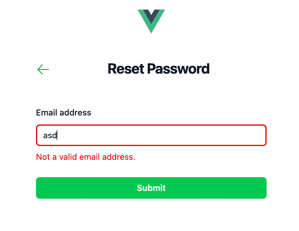
Not a valid email address.
</p>
<p
v-else-if="!signInData.error.email && signInData.payload.email"
class="mt-2 text-sm text-green-500"
id="email-valid"
>
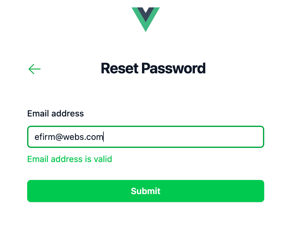
Email address is valid
</p>
</div>
</template>
</InputFieldComponent>
<!-- password -->
<InputFieldComponent
v-model="signInData.payload.password"
label="Password"
name="password"
placeholder="Enter your password"
:type="passwordInputType"
:error="signInData.error.password"
:required="true"
@update:modelValue="validatePassword($event)"
@focusout="handleInputPasswordFocusout()"
>
<template #cornerHint>
<RouterLink
:to="{ name: 'forgot-password' }"
class="font-semibold text-green-500 hover:text-green-600"
>
Forgot password?
</RouterLink>
</template>
<template #iconAfter>
<EyeIcon
v-if="isShowPassword"
class="col-start-1 row-start-1 mr-3 size-5 self-center justify-self-end text-gray-400 sm:size-4"
aria-hidden="true"
@click="handlePasswordToggle()"
/>
<EyeSlashIcon
v-else
class="col-start-1 row-start-1 mr-3 size-5 self-center justify-self-end text-gray-400 sm:size-4"
aria-hidden="true"
@click="handlePasswordToggle()"
/>
</template>
<template #helpText>
<div>
<p
v-if="!signInData.error.password && signInData.payload.password.length === 0"
class="mt-2 text-sm text-gray-500"
id="password-description"
>
Use strong password between 6 - 20 characters.
</p>
<p
v-else-if="signInData.error.password"
class="mt-2 text-sm text-red-600"
id="password-error"
>
Not a valid password. (must between 6 - 20 characters)
</p>
<p
v-else-if="!signInData.error.password && signInData.payload.password"
class="mt-2 text-sm text-green-500"
id="password-valid"
>
Password is valid
</p>
</div>
</template>
</InputFieldComponent>
...
</template>
replace the input email in ForgotPasswordView.vue
<script setup lang="ts">
import { reactive } from 'vue'
import { RouterLink } from 'vue-router'
import { ArrowLeftIcon } from '@heroicons/vue/24/solid'
import ButtonComponent from '@/components/ButtonComponent.vue'
import InputFieldComponent from '@/components/InputFieldComponent.vue'

const forgotPasswordData = reactive({
  payload: {
    email: '',
  },
  error: {
    email: false,
  },
})

function validateEmailAddress(value: string) {
  const rgxEmail =
    /^(([^<>()\[\]\\.,;:\s@"]+(\.[^-<>()\[\]\\.,;:\s@"]+)*)|(".+"))@((\[\d{1,3}\.\d{1,3}\.\d{1,3}\.\d{1,3}])|(([a-zA-Z\-\d]+\.)+[a-zA-Z]{2,24}))$/

  forgotPasswordData.error.email = false
  if (!rgxEmail.test(value)) {
    forgotPasswordData.error.email = true
  }
}

function handleInputEmailFocusout() {
  if (forgotPasswordData.payload.email.length === 0) {
    forgotPasswordData.error.email = false
  }
}
</script>

<template>
  <!-- email address -->
  <InputFieldComponent
    v-model="forgotPasswordData.payload.email"
    id="email"
    label="Email address"
    name="email"
    type="text"
    placeholder="Email"
    autocomplete="email"
    :error="forgotPasswordData.error.email"
    :required="true"
    @update:modelValue="validateEmailAddress($event)"
    @focusout="handleInputEmailFocusout()"
  >
    <template #helpText>
      <div>
        <p
          v-if="
            !forgotPasswordData.error.email && forgotPasswordData.payload.email.length === 0
          "
          class="mt-2 text-sm text-gray-500"
          id="email-description"
        >
          Use valid email address.
        </p>
        <p
          v-else-if="forgotPasswordData.error.email"
          class="mt-2 text-sm text-red-600"
          id="email-error"
        >
          Not a valid email address.
        </p>
        <p
          v-else-if="!forgotPasswordData.error.email && forgotPasswordData.payload.email"
          class="mt-2 text-sm text-green-500"
          id="email-valid"
        >
          Email address is valid
        </p>
      </div>
    </template>
  </InputFieldComponent>
</template>

<style scoped></style>
UI result
Let's check it out
sign-in page
forgot-password page
Congratulations! you have successfully implement component based UI using vue js.
Handle Form Submit
we will create a event handler for event form submit
the code is like this for page views/SigninView.vue
<script setup lang="ts">
...
async function submitSignIn() {
  // assume you will do REST API call to to your backend to sign in the user
  // const response = await helper.signIn(signInData.payload)
}
</script>

<template>
  <form @submit.prevent="submitSignIn()">
    ...
  </form>
</template>
for page views/ForgotPasswordView.vue
<script setup lang="ts">
...
async function submitForgotPassword() {
  // assume you will do REST API call to to your backend to forgot-password the user
  // const response = await helper.forgotPassword(forgotPasswordData.payload)
}
</script>

<template>
  <form @submit.prevent="submitForgotPassword()">
    ...
  </form>
</template>
Let's create logic for button component, so the button can be disabled when the input field is null or empty or error
for page views/SigninView.vue
<script setup lang="ts">
import { reactive, computed } from 'vue'

...
const isBtnDisabled = computed(() => {
  let result = false
  if (signInData.payload.email.length < 1 || signInData.payload.password.length < 1) {
    result = true
  } else if (signInData.error.email || signInData.error.password) {
    result = true
  }

  return result
})
</script>

<template>
  ...
  <ButtonComponent type="submit" :disabled="isBtnDisabled">
    <template #default>Sign in</template>
  </ButtonComponent>
</template>
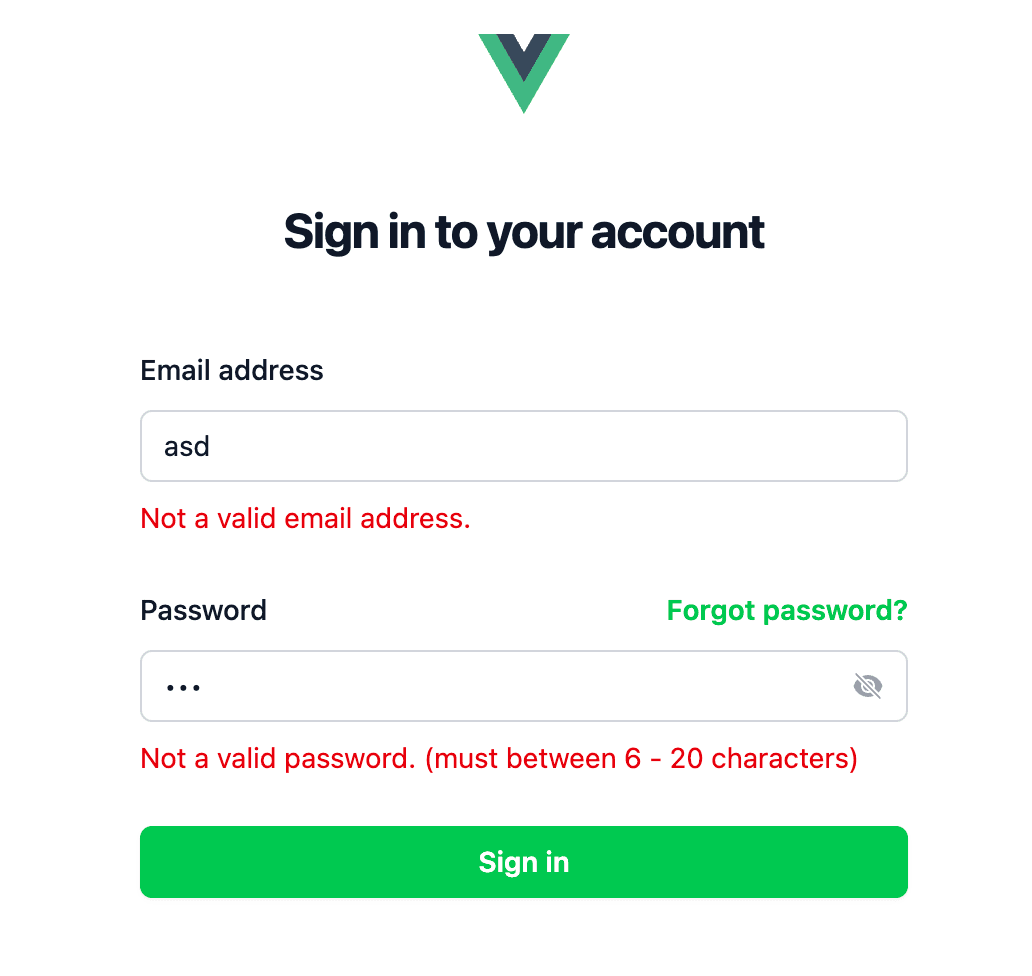
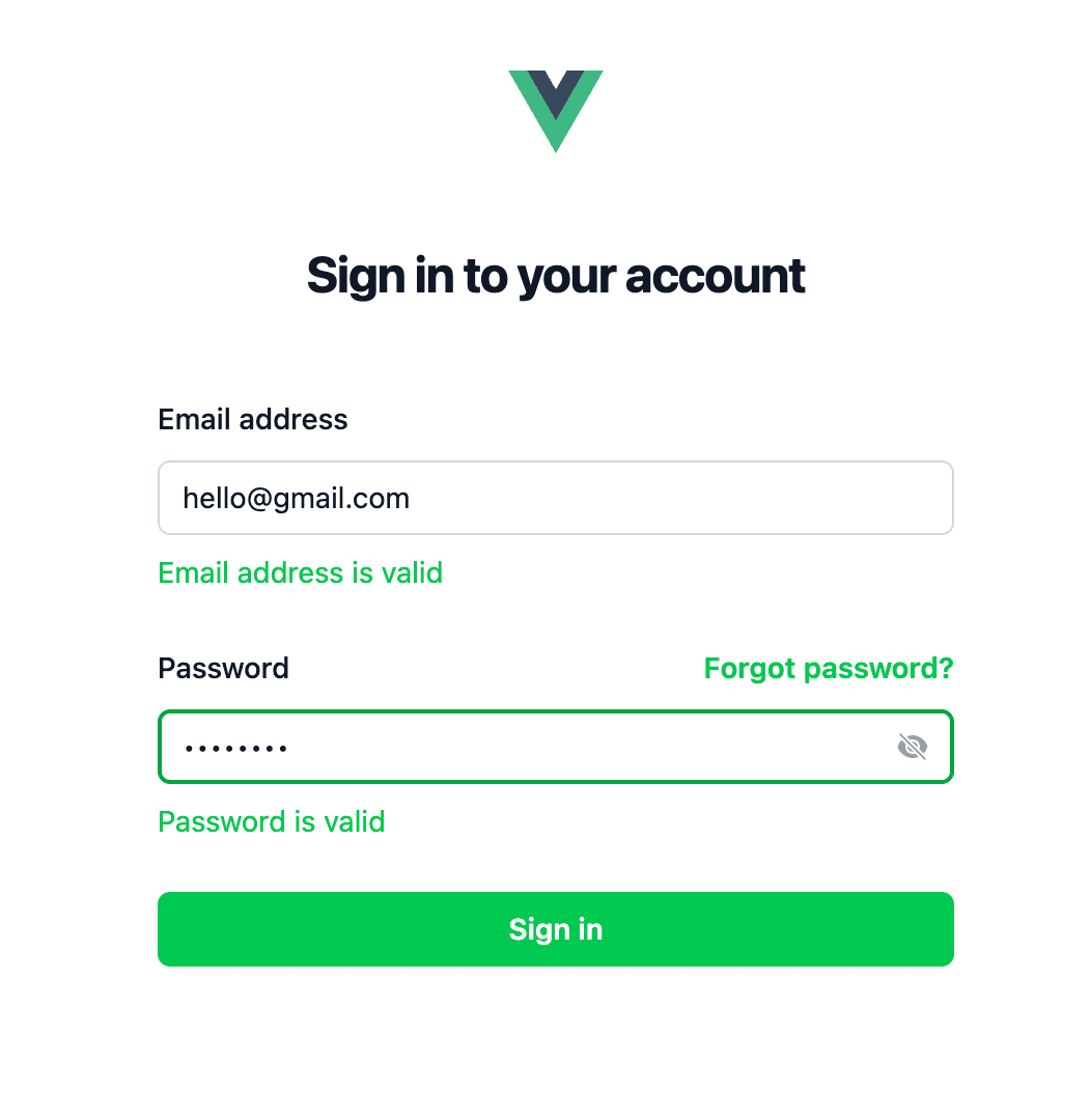
you should be able to see this
for page views/ForgotPasswordView.vue
<script setup lang="ts">
import { reactive, computed } from 'vue'

...
const isBtnDisabled = computed(() => {
  let result = false

  if (forgotPasswordData.payload.email.length < 1 || forgotPasswordData.error.email) {
    result = true
  }

  return result
})
</script>

<template>
  ...
  <ButtonComponent type="submit" :disabled="isBtnDisabled">
    <template #default>Submit</template>
  </ButtonComponent>
</template>
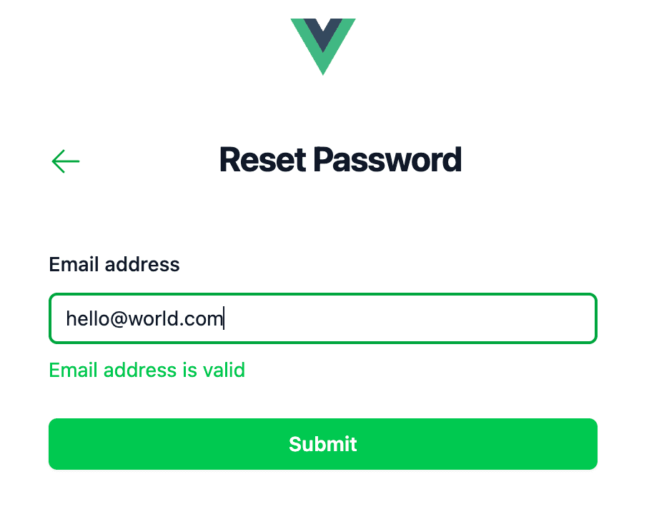
you should be able to see the page like this
Create Not Found Page
Next, we will create a Not Found page, so whenever a not-defined or not exist routes are visited by a user The user will know if they are on a page that does not exist. And it will give much better user experience.
views/error/404.vue
<!-- eslint-disable vue/multi-word-component-names -->
<script lang="ts" setup>
import { RouterLink } from 'vue-router'
</script>

<template>
  <div>
    <main class="grid min-h-full place-items-center bg-white px-6 py-24 sm:py-32 lg:px-8">
      <div class="text-center">
        <p class="text-base font-semibold text-green-600">404</p>
        <h1
          class="mt-4 text-5xl font-semibold tracking-tight text-balance text-gray-900 sm:text-7xl"
        >
          Page not found
        </h1>
        <p class="mt-6 text-lg font-medium text-pretty text-gray-500 sm:text-xl/8">
          Sorry, we couldn’t find the page you’re looking for.
        </p>
        <div class="mt-10 flex items-center justify-center gap-x-6">
          <RouterLink
            :to="{ name: 'sign-in' }"
            class="rounded-md bg-green-600 px-3.5 py-2.5 text-sm font-semibold text-white shadow-xs hover:bg-green-500 focus-visible:outline-2 focus-visible:outline-offset-2 focus-visible:outline-green-600"
          >
            Go back home
          </RouterLink>
        </div>
      </div>
    </main>
  </div>
</template>

<style scoped></style>
add not found route inside router/index.ts
const router = createRouter({
  history: createWebHistory(import.meta.env.BASE_URL),
  routes: [
    // add this route
    {
      path: '/:pathMatch(.*)*',
      name: '404-not-found',
      component: () => import('@/views/error/404.vue'),
    },
  ],
})
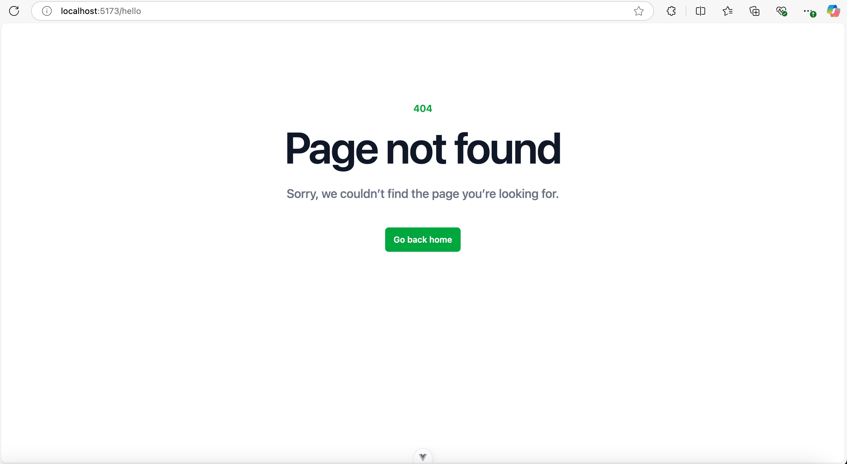
and you can visit any not found routes and it will show this UI
Challenge
I will challenge you to
- Make
validateEmailAddress()method reusable
and this is the clue for you
// InputValidator.ts
export function validateEmailAddress(value: string) {
  const rgxEmail =
    /^(([^<>()\[\]\\.,;:\s@"]+(\.[^-<>()\[\]\\.,;:\s@"]+)*)|(".+"))@((\[\d{1,3}\.\d{1,3}\.\d{1,3}\.\d{1,3}])|(([a-zA-Z\-\d]+\.)+[a-zA-Z]{2,24}))$/

  if (!rgxEmail.test(value)) {
    return true
  }

  return false
}
- Make
ButtonComponent.vueuse custom css
and this is the clue for you
<!-- ButtonComponent.vue -->
<style scoped>
  .btn-disabled {
    @apply bg-gray-400 hover:bg-gray-400/75 cursor-not-allowed;
  }
  .btn-primary {
    @apply bg-green-500 hover:bg-green-600 cursor-pointer focus-visible:outline-2 focus-visible:outline-offset-2 focus-visible:outline-green-600;
  }
</style>
and you can easily use the css class btn-disabled and btn-primary in the <button> element
- Create a
HelperMessage.vue,ErrorMessage.vue,ValidMessage.vuecomponent
and then use it like this inSigninView.vueandForgotPasswordView.vue
<!-- SigninView.vue -->
<script setup lang="ts">
  ...
  import HelperMessage from '@/components/HelperMessage.vue'
  import ErrorMessage from '@/components/ErrorMessage.vue'
  import ValidMessage from '@/components/ValidMessage.vue'
</script>
<template>
  ...
  <!-- email address -->
  <InputFieldComponent
    v-model="signInData.payload.email"
    id="email"
    label="Email address"
    name="email"
    type="text"
    placeholder="Email"
    autocomplete="email"
    :error="signInData.error.email"
    :required="true"
    @update:modelValue="validateInputEmailAddress($event)"
    @focusout="handleInputEmailFocusout()"
  >
    <template #helpText>
      <div>
        <HelperMessage
          v-if="!signInData.error.email && signInData.payload.email.length === 0"
        >
          Use valid email address
        </HelperMessage>
        <ErrorMessage v-else-if="signInData.error.email">
          Not a valid email address
        </ErrorMessage>
        <ValidMessage v-else-if="!signInData.error.email && signInData.payload.email">
          Email address is valid
        </ValidMessage>
      </div>
    </template>
  </InputFieldComponent>
  ...
</template>
Conclusion
Congratulations! You have build a frontend app using Vue 3 Composition API and TypeScript and Tailwind CSS.
I hope you are now understand how to use Vue 3 to create Single Page App.
Thank you for reading and your attention. See you on the next post.
As always, the full version of the code is available over on GitHub vue-tailwindcss-introduction